ParentEve's Interface
The Main Window
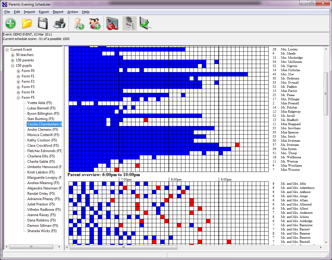
The primary interface to the ParentEve program is its main window
as shown below:
 It is composed of three areas:
- A summary area at the top (underneath the menu and toolbar), which displays the description of the current event being edited and the score it currently has
- A "tree" on the left, which displays all of the parents, teachers and pupils
- An overview area on the right, which provides a graphical overview of the whole event.
The Toolbar
The toolbar contains icons representing some common
operations and actions, and allows you to quickly perform these actions without
having to select them from the menu.
The buttons are, in order:

- New event: allows you to create a new parents' evening, as described in Start Working on an Event .
- Load event file: loads an event file from disk that you have previously worked on.
- Save: saves the current event to your disk. If you have not yet chosen a filename for the file to be saved under, the program will ask you to choose one. Once the program knows the name of the file it will not ask you again. It is good practice to save your work often.
- Print: starts the print process for printing out all of the handouts. Pressing this button will make the program show a "Print Preview" window which shows you what your handouts will look like. From this window you can choose which ones to print, how many copies you would like and which printer to print them on.
- Import teachers: reads in a list of teachers from your MIS or from a file. This is the most common way of telling ParentEve about your teachers - you export a file from your MIS system and ParentEve reads it in.
- Import pupils: reads in a list of pupils and parents from your MIS or from a file. This works in the same way as the teacher import, except that the file contains pupil definitions. Most MIS systems can export a pupil's parent at the same time, so ParentEve will use this list to create parents too if possible.
- Rebook: clears all of the current appointment times and rebooks all the parents back in on a first-come-first-served basis.
- Book Unbooked: searches for any unbooked requests, and books them in. This leaves the existing appointments untouched and should be used after entering any new requests for parents to see teachers.
- Optimise: moves existing appointments around, trying to reduce the length of time that both parents and teachers have to wait.
The Overview Area
This area shows a graphical overview of the current schedule. If you have a small screen it may not all fit on, but you can scroll it around using the scroll bars on the left and bottom edges in order to see the whole thing. The overview area consists of two grids, one representing the teachers and one representing the parents. The grids list people against time, so teachers and parents are listed down the side (the vertical axis) and time is considered to be the horizontal axis. Each square represents a single appointment slot, with the start of the evening on the left hand side and the end on the right. Each square can be one of the following colours:
- White: a free slot with no appointment
- Red: a booked slot where there is an unacceptable delay directly before it
- Blue: a booked slot with no delay or an acceptable delay beforehand
- Purple: one of two booked slots for twins, where the other twin's appointment is not immediately before
- Grey: a slot where the person in question is not able to attend
- Yellow: a teacher's break